
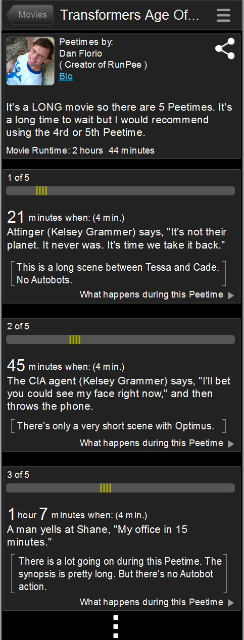
I’d love to get your feedback on a possible change to the app. Currently we have information about each Peetime at the top of the Peetime screen where we briefly describe what happens during each scene. That way you’ll have some idea if you’ll be missing an action scene, or character development, or whatever.
Would it be easier to digest if those brief descriptions were included under the cue for each Peetime? Or should I leave them all grouped together at the top?
The photos below show the current view and a mockup of what it would look like if I changed it.
Join the PERA (Personal Entertainment Research Assistant) waitlist.
The World's Most Indispensable Movie App
The RunPee app tells you the best times to
run & pee during a movie
so you don't miss the best scenes.


Download the RunPee app.
100% free (donation supported)
Please let me know which you would prefer.
Currently looks like this ->
What people are saying
about the RunPee app.
This is a great app. I wish more people would support it
This app provides info about movies, reviews, ratings from people who have seen it before and after viewing. It has links to info about the movies. It let's you know when there will be a lull in the action and how long it will last. If you want to know what happens during that time, you can check the brief synopsis (you have to click a link, so no accidental spoilers). It has a timer you can set (silent) to alert you to a break. It also tells you whether there is anything extra during or after the credits. It's really a wonderful app. I've subscribed for a couple of years to support the developers, but I noticed some of the links to provide feedback didn't seem to work today. They also made it free, with voluntary donations to see the pee-times. If you haven't tried it, I encourage you to do so, and subscribe if you like it. I really hope the app is supported so it can continue to be maintained!
Developers note: RunPee doesn't make much money but it supports itself nicely. Donations are appreciated, but not required. We'll add as many movies to the database as we can until there are no more movie theaters.
View all reviews
Apple App Store | Google Play Store
Download RunPee app


Possible change ->
Creator and developer of the RunPee app. When something doesn’t work right in the app it’s pretty much his fault. 🙂
Aspiring author. Would like to finish his “Zombie Revelations” trilogy if he could break away for working on RunPee and the cottage he’s building for RunPee Mom.
I like the new proposed layout way better.
Thanks. That’s the direction the feedback is going. I guess I have more work to do. 🙂
I don’t see a difference❓
Look at the top image where it has “suggested peetimes”. All of the descriptions of each Peetime is listed there. In the bottom image the descriptions are moved to the actual Peetime button – in [brackets].
I prefer the new layout.
Comments are closed.