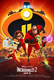
 I was looking at the poster for the upcoming Incredibles 2 film, and noticed that it looked awfully familiar. And not just because I saw and enjoyed the first Incredibles film in 2004, but because the poster seemed…exactly like a Marvel film. Specifically, one in the Marvel Cinematic Universe, AKA, the MCU.
Here’s the poster for Incredibles 2:
Join the PERA (Personal Entertainment Research Assistant) waitlist.
The World's Most Indispensable Movie App
The RunPee app tells you the best times to
run & pee during a movie
so you don't miss the best scenes.
Download the RunPee app.
100% free (donation supported)
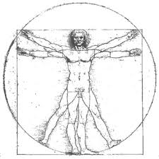
Notice the shape, the look, the radial bi-symmetry of the thing, the arms reaching out, the circles on circles.
Now compare that with the current MCU blockbuster…..
What people are saying
about the RunPee app.
January 4, 2019
RunPee is one of my favourite apps. No more googling a film before you see it and risking spoilers, this app has everything you need to know, not just the best time to go to the toilet. Dan, the developer, also offers an amazing customer service experience. I recently switched phones, and Dan was very generous in sorting things out with me as I moved over to my current system. If you're an avid film watcher, this is the app for you!
View all reviews
Apple App Store | Google Play Store
Download RunPee app
Avengers: Infinity War. See the background circle, the hands stretching out, the DaVinci’s Vitruvian Man of the thing?
This is the new look in the last few years for action and superhero movies. I’ll go back a few more MCU films to point this out:
Black Panther‘s got the circles, the big head at the top, similar character groupings.
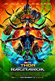
Thor: Ragnarok really has the thickly layered Vitruvian Man thing going on, lots of circles, the bilateral symmetry. We can clearly see there’s some branding going on.
But wait…another Marvel property followed the look:
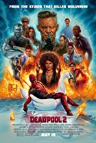
Deadpool 2 can get away with this, because a) it’s a Marvel superhero film (not in the MCU, but still), and b) it’s a parody film that sees no harm in poking fun at the “Avengers thing”.
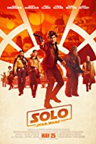
Where it gets a little weird is seeing this imagery pop up in non-Marvel, non-superhero films, like Solo: A Star Wars Story.
It’s not exactly the same, but someone definitely got the memo about the symmetry, the circles, and the layered character arrangement. Here the circles actually make sense, in-story, because we’re obviously looking through the cockpit of the Millennium Falcon. But the similarities are still there. We know that Star Wars is now owned by Disney, who owns Marvel, and also owns Pixar, which is how we get right back around to Incredibles 2, a Pixar film.
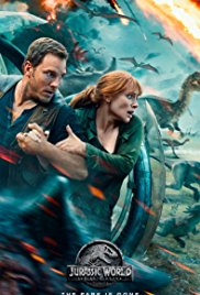
Disney’s probably doing some branding, and us good little audience goers now recognize this poster imagery as a form of code: Adventure Ahead. Universal Studios is, by contrast, not doing this little movie shorthand on their posters. Look at Jurassic World: Fallen Kingdom for reference:
See? There ARE other ways to make an adventure poster. We’ve just gotten used to Disney’s featured look. We’ve been “branded”.
My guess is we will keep seeing this kind of poster until a certain level of saturation sets in. And then Disney will come up with a new stylized code for their big blockbuster properties.
Back to Incredibles 2 – this is, like Deadpool 2, a superhero parody that also plays the story straight. (Incredibles is a reworked version of the Fantastic Four, just done right.)
There’s no big meaning to these kinds of things, but it’s still interesting to see how we relate to movie poster images. And the callback to the Vitruvian Man is surely one of the oldest memes. Someone on Disney’s team grabbed that ancient archetype and ran with it.
I look forward to what happens when a non-Disney poster unthinkingly follows suit and uses this look. Like maybe when the next DC superhero film comes out. Disney will probably freak and file a lawsuit, but last I heard, DaVinci’s art is royalty-free, and circles are even older.
Co-Creator of RunPee, Chief of Operations, Content Director, and Managing Editor. RunPee Jilly likes galaxy-spanning sci fi, superhero sagas, fantasy films, YA dystopians, action thrillers, chick flicks, and zany comedies, in that order…and possesses an inspiringly small bladder. In fact, that little bladder sparked the creation of RunPee. (Good thing she’s learned to hold it.)

