The app that tells you the best time to run and pee during a movie without missing the best scenes.

100% free (donation supported) iPhone | Android

Feedback needed for potential update to app

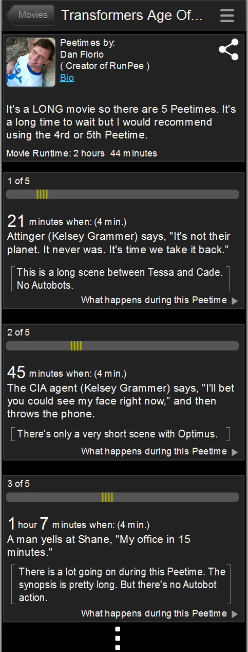
I’d love to get your feedback on a possible change to the app. Currently we have information about each Peetime at the top of the Peetime screen where we briefly describe what happens during each scene. That way you’ll have some idea if you’ll be missing an action scene, or character development, or whatever.

Would it be easier to digest if those brief descriptions were included under the cue for each Peetime? Or should I leave them all grouped together at the top?

The photos below show the current view and a mockup of what it would look like if I changed it.

——Content continues below——

The World’s Most Indispensable Movie App

The RunPee app tells you the best times to
run & pee during a movie
so you don't miss the best scenes.


As seen on

Download the RunPee app.
100% free (donation supported)

Get the RunPee app at the Google Play Store       Get the RunPee app at the Google Play Store

Read more about the RunPee app.


Please let me know which you would prefer.

Currently looks like this ->

Current layout
Current layout


Possible change ->

Mockup of possible change.
Don’t miss your favorite movie moments because you have to pee or need a snack. Use the RunPee app (Androidor iPhone) when you go to the movies. We have Peetimes for all wide release films every week, including Wicked, Gladiator II, Red One, The Wild Robot and coming soon  Moana 2, The Lord of the Rings: The War of the Rohirrim, Kraven the Hunter, Mufasa: The Lion King and many others. We have literally thousands of Peetimes—from classic movies through today’s blockbusters. You can also keep up with movie news and reviews on our blog, or by following us on Twitter @RunPee. If there’s a new film out there, we’ve got your bladder covered.

Comments

5 responses to “Feedback needed for potential update to app”

  1. garytemme Avatar
    garytemme

    I like the new proposed layout way better.

    1. Thanks. That’s the direction the feedback is going. I guess I have more work to do. 🙂

  2. Ronoftuscany Avatar
    Ronoftuscany

    I don’t see a difference❓

    1. Look at the top image where it has “suggested peetimes”. All of the descriptions of each Peetime is listed there. In the bottom image the descriptions are moved to the actual Peetime button – in [brackets].

  3. Robert Drummer Avatar
    Robert Drummer

    I prefer the new layout.

Leave a Reply

Your email address will not be published. Required fields are marked *

RunPee